Introduction
This piece is a Photoshop graphic design project that I completed for COM 561: Multimedia Content Creation in Summer 2022. My instructor was Justin Barnes.
In COM 561, students learn to develop and communicate ideas clearly, concisely, and effectively through multimedia content.
Multimedia perspective involves the convergence of text, graphics, audio and video, and the distribution of these assets over the internet. It also requires critical thinking, information literacy, communication proficiency, and self- and peer-evaluation.
To create diverse multimedia content requires training in multimedia content creation software. To develop these skills, students will work through a number of tutorials. Students will use the skills learned in the tutorials to complete creative multimedia storytelling assignments. Students will create and manage a course blog on the web where they will post assignments and interact with fellow students through content critiques.
However, skill without an understanding of the underlying principles and theories is not enough. The best communicators practice their skills within a framework derived from principles, theories and research. Therefore, as foundation, principles and theories will be offered in three areas: aesthetics, design and interactivity, including user-centered design and social interactivity.
Students will choose a topic at the beginning of the semester. This topic will be used throughout the semester on each content creation assignment. Students are encouraged to choose a topic relevant to their current position or profession, and use the assignments to create an online portfolio. Regardless of the topic, students must craft their multimedia content to communicate specific ideas to a diverse web-based audience through their course blog.
Students will work in “peer critique groups” throughout the semester. Students are expected to provide constructive feedback about their group members’ draft multimedia creations using design principles and technical advice. These critiques should be focused on helping designs achieve their communication goals, as described in the accompanying written blog post. In addition to self-reflection, this exercise in critical thinking and peer feedback will form the basis for design revisions and final projects.
Project Background
My overall objective in this class was to create content for PeaceHealth Pride, the LGBTQ+ employee resource group for which I was a Co-Chair. This work was intended to illustrate the ways in which visual content can promote diversity, equity and inclusion. I was able to use these projects as a starting point to create multiple campaigns digital and print campaigns. The first two themes were “You Belong Here” and “The Power of Pride.” As someone who identifies as queer, this is a topic that is very personal for me.
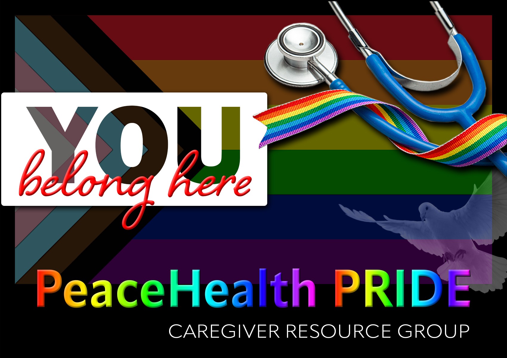
My goal with this specific piece was to convey a sense of belonging and community for LGBTQ+ caregivers and allies. I also wanted the design to contain easily recognizable elements which are associated with the both the queer community and the organization for which we work.
The colors of the rainbow have long been a symbol of LGBTQ pride. In 1978, Harvey Milk, one of the first openly gay elected officials in the U.S., asked artist Gilbert Baker, an openly gay man and drag queen, to create a symbol to celebrate members of the gay and lesbian political movement. Baker designed the first rainbow flag which was embraced internationally as the symbol of the LGBTQ community.
I chose to include an image of a newer version of the flag in my design. The Progress Pride flag was developed in 2018 by Daniel Quasar, a non-binary artist and designer who uses xe/xyr pronouns. Based on the iconic rainbow flag from 1978, the redesign celebrates the diversity of the LGBTQ community and calls for a more inclusive society. In addition to the traditional rainbow colors, the Progress Pride flag added five new colors: black and brown to represent people of color, and pink, light blue and white to represent transgender, gender non-binary, intersex, and those across the gender spectrum.
I was unable to incorporate the PeaceHealth logo into my design because of copyright concerns so I show to instead feature a photograph of a dove, the symbol of peace which the organization uses in much of its branding. To represent the healthcare industry and the lifesaving work that our caregivers provide for our community every day, I also included a photograph of a stethoscope draped with a rainbow ribbon. The stethoscope is blue, the color most commonly used in PeaceHealth’s marketing.
Initial Design Process
In Photoshop, I created a 1700 x 1000 image with a black background. I added the Progress Pride flag image and set the opacity to 35%. I then used a watercolor filter to add definition to the triangles in the flag.
Using the rectangle tool, I created a white box where my text, “You Belong Here” would be added. Rather than use plain text for the “You,” I added cutout letters so the pride flag colors would show through. I did this by first using the type tool and a bold font (Franklin Gothic Heavy) to add the word. I then double-clicked on top of the text layer thumbnail to open the layer styles. In the advanced blending tab, I chose shallow as the knockout option and changed the fill opacity to 0%. I selected both the text and shape layers and grouped them together by clicking on the folder icon in the layers panel. Now that I had my cutout “One,” I used the type tool to add “belong here” in a script font (Shelby Bold). I chose a bright red color and used bevel and emboss to give it depth.
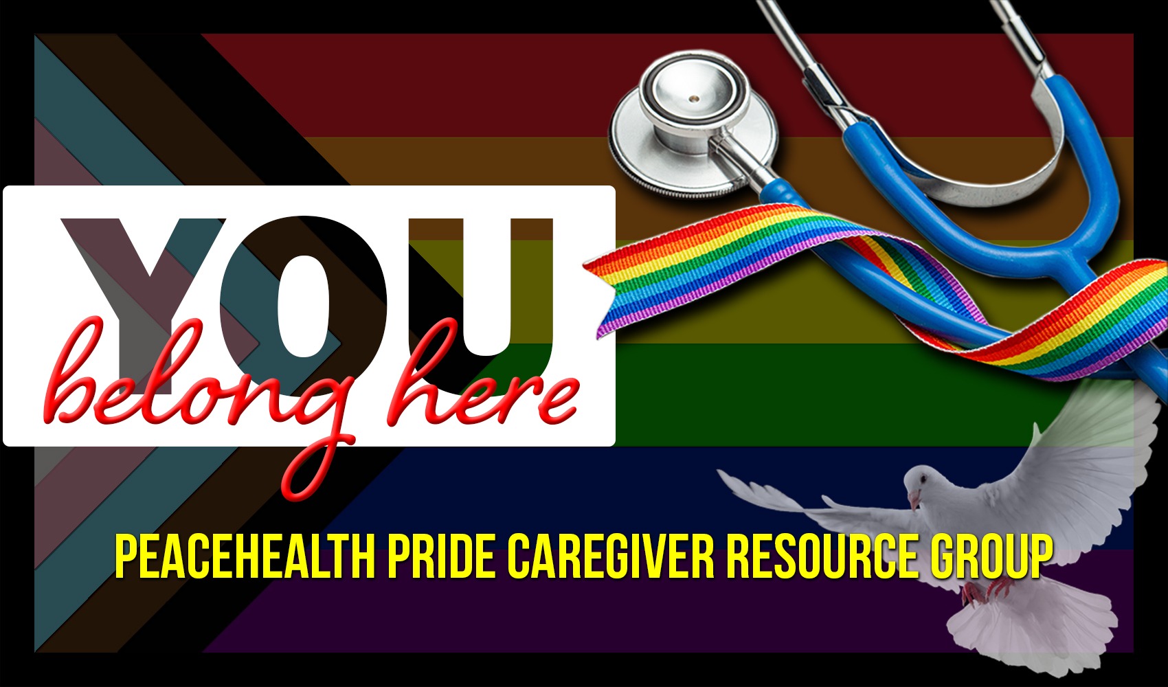
For the stethoscope, I used the pen tool to remove the background using the “layer via copy” technique from our Photoshop tutorials. I also added a drop shadow to make the image stand out against the rainbow flag background. Because the dove photograph was on a high-contrast background, I was able to use the magic wand tool instead of the pen tool. I used the “flip canvas horizontal” tool in image rotation to reverse the direction the dove was facing and then lowered the opacity to 70%. Lastly, I used the type tool to add “PeaceHealth Pride Caregiver Resource Group” in yellow with a drop shadow.
Revisions
Common themes that came out of classmate critiques were that the text at the bottom of the design, “PeaceHealth Pride Caregiver Affinity Group” was getting lost among the other elements, that the Progress Pride flag background was a bit dark and that the dove was making the composition look busy.
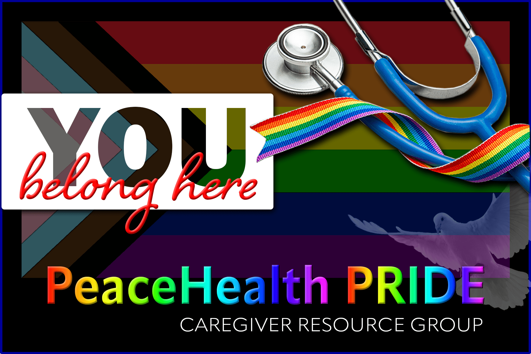
As I was working on the first draft of my graphic design project, the element I struggled with most was the text at the bottom: PeaceHealth Pride Caregiver Resource Group. I was not happy with the font I chose and wasn’t sure that making the text yellow was the right decision. I loved Ebba’s suggestion to make the text rainbow-colored instead and made that change in my final piece. I changed the font to Apparat Semi-Condensed Bold, with “PeaceHealth” in sentence case and “Pride” in capital letters.
To achieve the rainbow effect, I created a new gradient. First. In the gradients panel, I selected “new gradient group” and called the group “My Gradients.” I clicked on the gradient tool and then, in the options bar, clicked on the gradient swatch to open the gradient editor. I selected the “black, white” gradient in the presets and changed the black color stop to red (255, 0, 0). I left the location value at 0%. I added a new stop at 20% and changed the color to yellow (255, 255, 0). Next, I added a green color stop (0, 255, 0) at 40%, cyan (0, 255, 255) at 60%, blue (0, 0, 255) at 80% and magenta (255, 0, 255) at 100%. I saved the new gradient, calling it “Rainbow” and clicking “new.” I dragged and dropped the rainbow gradient thumbnail only the text and then edited the gradient overlay layer effect and changed the direction from vertical to horizontal by setting the angle to 0. I moved “Caregiver Resource Group” under the “PeaceHealth Pride,” changing the font to Apparat light and white.
I adjusted the opacity of the Progress Pride flag from 35% to 40% since I received feedback that the background was too dark. I also reduced the opacity of the dove from 70% to 35%. Lastly, I changed the height of the canvas to 1200px to add some black space at the bottom of the design for the text.
Reimagined as a Greeting Card
For my final COM 561 project, I chose to revisit the first Photoshop Graphic Design assignment. I loved the image that I created and thought it would be perfect for a brand new greeting card that we could send to welcome new PeaceHealth Pride members.
First, I adjusted the size of the image to accommodate printing it on a 4 x 6 inch greeting card. I needed to adjust each individual layer to make the composition work within the new canvas size, and was grateful for some of the tricks we learned in the tutorials. To give the front of the card a more polished look, I added a thin blue border around the entire image. I did this by using the rectangle took to create a blue box, then moving it the back of all of the layers.
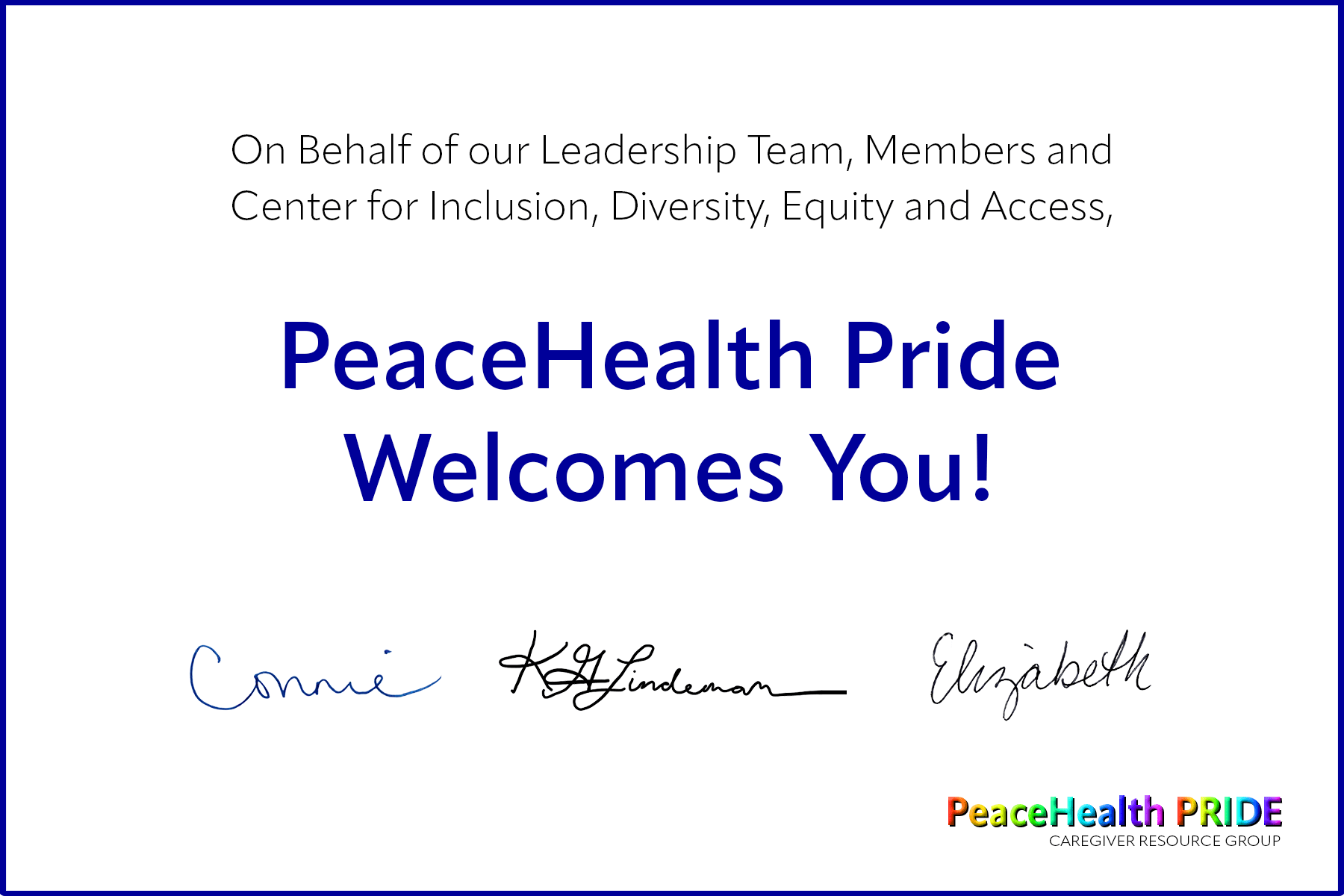
Next, I created a second image for the message on the inside of the card. I was initially planning to make the inside monochromatic but ultimately decided that the all black text did not match the vibrant look and feel of the rainbow-filled cover image. I kept the first two lines (“On behalf of…”) black and used a lighter weight for the Myriad Pro text. For the next two lines (“PeaceHealth Pride Welcomes You”), I used a semi-bold version of the same Myriad Pro font and changed the color to “PeaceHealth Blue.” To maximize the use of color, I added small versions of the rainbow-gradient “PeaceHealth Pride” text and subheading from the cover. The second line was white on the front so I changed the color to black so it would be visible on the inside of the card.
Lastly, I added the signatures of our three leaders. That proved to be trickier than I expected! My partners live and work in Oregon and didn’t have immediate access to a scanner. Instead, they took photos of their signatures using their mobile phone cameras and emailed them to me. I used Photoshop to remove the background color and saved the signatures as PNG files with transparent backgrounds. Finally, I used the “place” tool to add the embedded files.
Work cited
- Adragan. (n.d.). Stethoscope and LGBT rainbow ribbon pride. Adobe Stock. Retrieved May 21, 2022, from https://stock.adobe.com/images/stethoscope-and-lgbt-rainbow-ribbon-pride-symbol-medical-support-after-sex-reassignment-surgery-grey-background/290759290.
- Okeo. (n.d.). Dove flying. Adobe Stock. Retrieved May 21, 2022, from https://stock.adobe.com/images/dove-flying/13157983.
- Vector Archive. (n.d.). Progress Pride Flag. Adobe Stock. Retrieved May 21, 2022, from https://stock.adobe.com/images/new-lgbtq-pride-flag-vector-new-updated-intersex-inclusive-progress-pride-flag-banner-flag-for-lgbt-lgbtq-or-lgbtqia-pride/438762190.


